Alice Lines is an experienced editor and stylist, with work spanning creative direction, publishing, and interiors. Through masterful storytelling she empowers others to create spaces that nurture living well at home.
STYLING
Styling is an impactful tool to elevate visual storytelling to share your products or narrative. Working both in studio, and on location Alice can build a room set, or curate a scene to express your brand values.
STORIES
Alice’s work includes feature writing and interviews with a special interest in home, design, art and travel. She’s adept at producing content to share across multiple channels — in print, online and through podcasts and videos.
SPACES
Collaborating with architects, developers and brands, Alice brings residential interior environments to life with furniture, art and objects. Her aesthetic is built around a curation of local, handmade and vintage pieces.
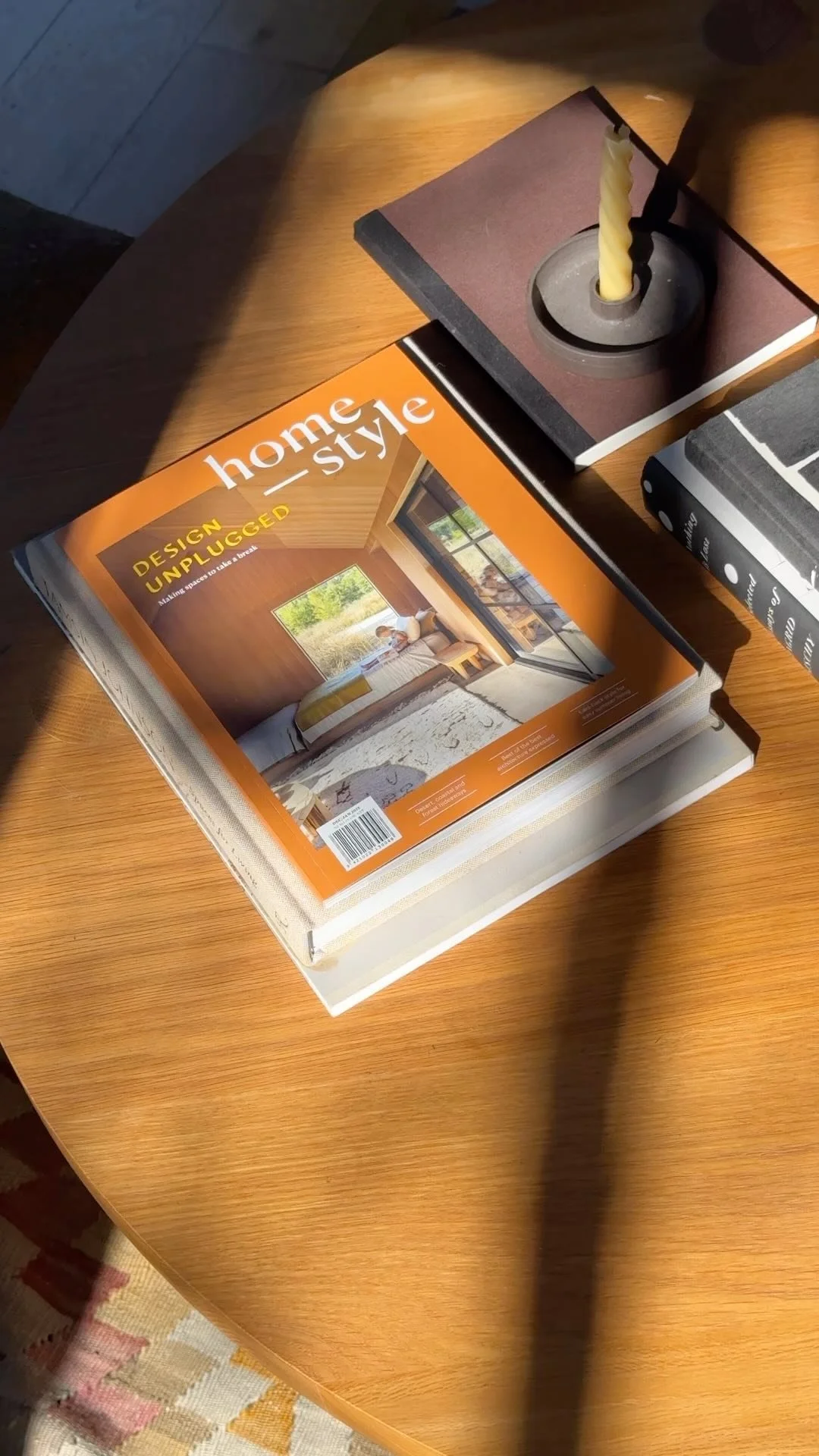
JUNE/JULY 24
Cover Architecture Pac Studio
Photography Sam Hartnett
Inside the lastest homestyle
Okay, I have to confess, colour hasn’t always been my thing. I mostly wear black, plenty of my household possessions are in relatively muted hues and anything with a raw finish will always have my heart — here’s looking at you, bagged-brick cladding, unglazed ceramics and slubby linen weaves.
That said, for some reason, the season of life I’m currently in has me craving something bolder, something brighter, so while researching the homes we’ve decided to share with you this issue, I was excited to find others have been feeling the same way. Recently we featured Kate and Aaron Paterson’s wild and wonderful Tamaki Makaurau garden, and revisiting to photograph their renovation increased my colour curiosity. In a street dotted with white and grey dwellings, the paints (and aforementioned landscaping) they’ve opted for really set their bungalow apart. Take a look and be inspired by how they’ve used not just their walls but also their window frames, skirtings, skylights and then some to infuse optimism into every corner.
From one Tamaki Makaurau architect’s home to another, Kate Rogan’s new pad takes you on a creative journey through a whole spectrum of hues too. I’ve never met a beige powder room I’ve loved as much as hers. See how well it works with the green, blue and pink in each new room you encounter.
Catchy phrases like dopamine dressing, chroma couture and rainbow renaissance have been popping up everywhere I look while I’ve been considering where this colour crush might lead me in my own life. I’m not one to get caught up in a trend cycle, though, and imagining you might feel the same, we’re not trying to predict what the next hot hue will be. Our hope is that each issue of homestyle might help you to determine what you’re genuinely drawn to — whether that’s colour or not.
While producing this issue, I’ve been...
3
… Reminding myself to look up. When visiting Kate and Aaron Paterson’s place, that meant not missing the lightwells, from which the glow of Dulux Arrow River beams down into the dining and living spaces. I love this interplay of colour and light!
1
… Admiring Kate Rogan’s tonal kitchen. Considering a change at your place? You might like to take a leaf out of her green-on-green book. This colour can function like a neutral because it’s harmonious with so many other colours — just like in nature.
2
… Increasing the saturated colours in my garden. Although I haven’t yet been brave enough to splash bright paint around the house, bringing fresh flowers inside has been a fun way to add to our interior palette.
4
… Feeling the power of a pop of Yves Klein Blue. We recently got a new sofa from Woodwrights, and after pondering neutral versus bold upholstery, I’m glad we went for the latter. Here’s to the mood- boosting effect of going bright.


